Complete renewal of icons in the app
Based on flat design
Based on a simple flat design, the icons in the application have been completely redesigned.
CTO also uses Paint.NET to create icons
I (CTO Satoshi Tanabe) am an engineer, but I put a lot of energy into creating the new icons in the app myself.
The standard icon size for Windows is 16x16px, which is very small. Also, compared to MacOS, visibility tends to be poor due to the low resolution of the monitor.
In such a small world, it takes a lot of ingenuity to figure out how much information to pack into such a simple, intuitive operation.
By the way, the designer is Adobe Illustrator I used to use it, but I Paint.NET Created in
This is a little technique, but when overlapping icons, if you use transparency around the overlapping icon, it will improve visibility when the image is scaled down to 16x16px. I was told by the designer that it is difficult unless you use Adobe Illustrator, but it seems that Paint.NET is sufficient for this purpose.
Icons are limited to circles, ovals, and rectangles, but they can be simply cut and stacked along the shape of the icon to be stacked, leaving a margin between the icons!
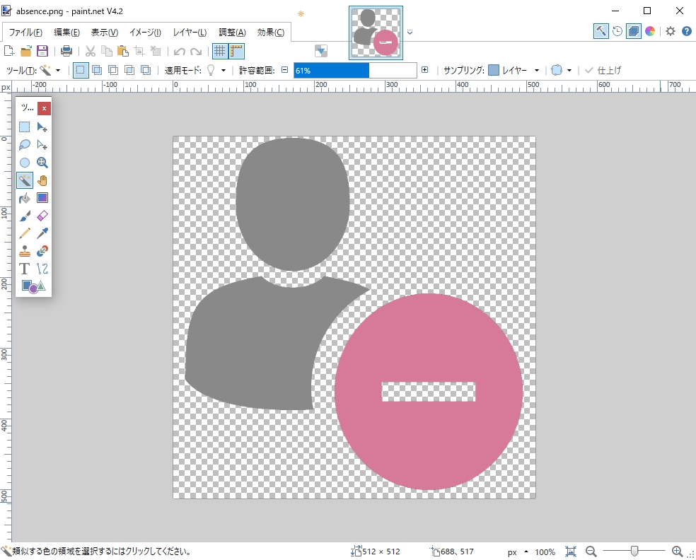
Also, Paint.NET's "magic wand" is incredibly useful.
Other
- Fixed a bug that only the specified user is notified when he/she specified a mentions in the chat.
When a user in a chat room is selected with the mouse, it becomes a Mention notification and is shared with the entire chat room. - Defect handling in the user tab in the cloud model